Incredible New Liquid Glass Technology Explained Simply
When Apple introduced Liquid Glass at WWDC 2025 on June 9, it marked the biggest redesign of their user-interfaces in over a decade. This new design language stretches across iOS 26, macOS Tahoe, iPadOS 26, watchOS 26, tvOS 26, and visionOS, adding a level of polish, fluidity, and consistency previously unseen. TechCrunch+3The Verge+3Indiatimes+3
Here’s everything you need to know about Liquid Glass — what it is, what’s new, how it’ll affect users, the criticisms, and what’s coming next.
What Exactly Is Liquid Glass?
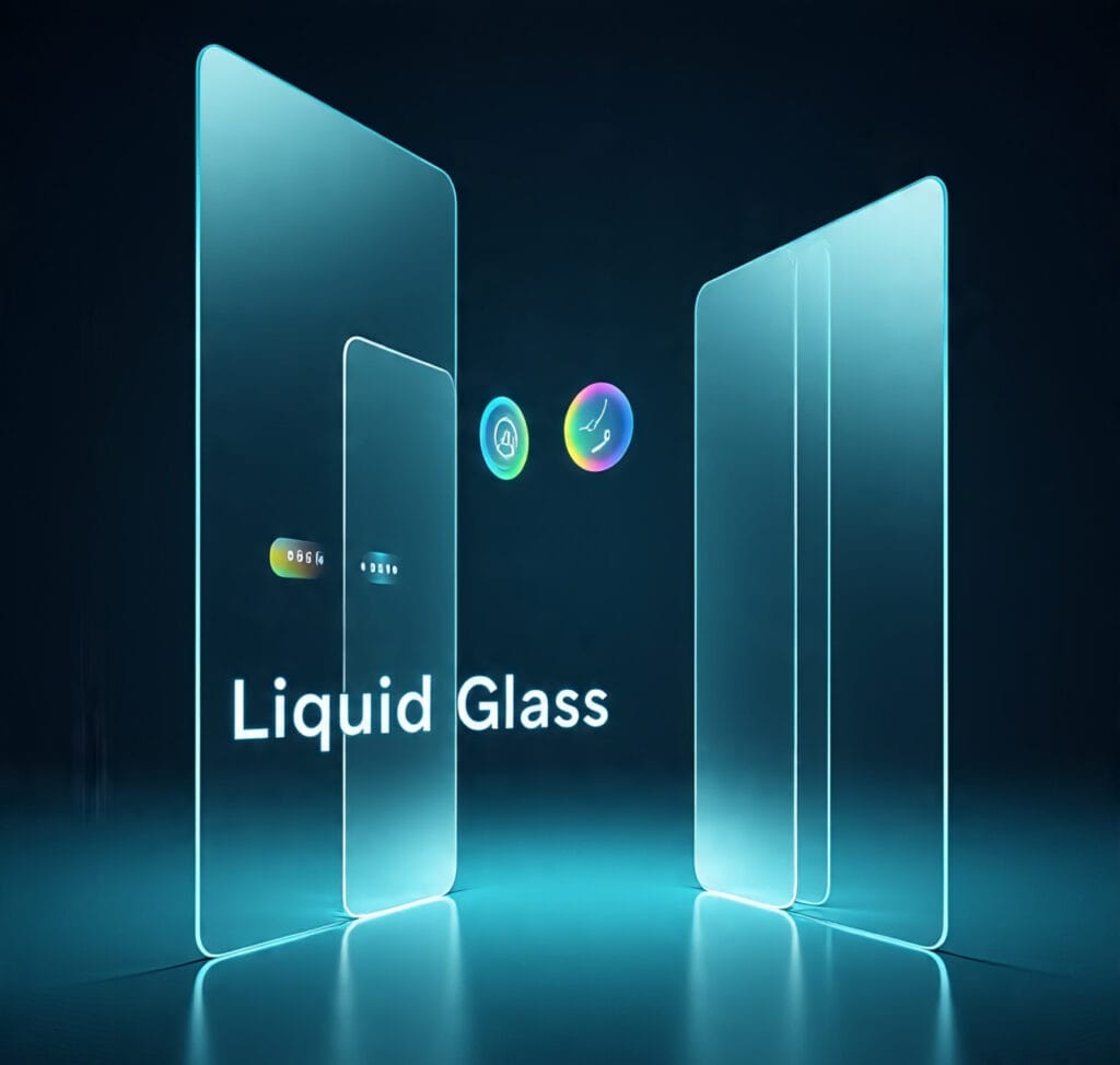
- Design Language: Liquid Glass is a software design language—not a physical glass. It creates UI elements that look and behave like glass: translucent, with light refractions, adaptable color, and fluid animations. OWC+2The Verge+2
- Visual Qualities: It uses “optical qualities of glass” such as reflectivity, translucency, real-time rendering, and specular highlights. Interface elements adapt to light/dark mode and background content. OWC+2The Verge+2
- Dynamic Behavior: UI pieces (buttons, toolbars, navigation bars, sidebars, etc.) morph or shift slightly based on user interaction, device motion or background content. OWC+1
Where It’s Being Applied
Liquid Glass isn’t just a small tweak—it’s everywhere in Apple’s ecosystem:
PlatformAreas affected / Examples 26Lock Screen, Home Screen, Control Center, Notifications, app icons, widgets. OWC+1macOS TahoeMenu bar, sidebars, dock, window controls get new glassy/translucent, unified look. The Verge+1iPadOS 26Floating sidebars/widgets, resizable windows, UI control adjustments. computerhardwareinc.com+1watchOS & tvOSInterface redesign to match transparency & glass effect; widgets, navigation visuals update. The Times of India+1
What’s New vs What Changed
- Transparency Adjusted: In early betas, some Liquid Glass UI elements were too transparent. Users complained text/icons behind glassy panels were hard to see. In recent developer beta updates, Apple has “frosted” or solidified some translucent elements (navigation bars, buttons, tabs) to improve readability. The Verge+1
- Unified Design Across Devices: Apple is pushing for consistency—same design language across phone, tablet, watch, TV, etc. This helps with brand identity and user experience. The Verge+2OWC+2
- Developer Tools & Guidelines: New Human Interface Guidelines (HIG) have been updated, new APIs available for SwiftUI, UIKit, AppKit to help app developers adopt Liquid Glass. OWC+1
Benefits of Liquid Glass
- Visual Appeal & Modern Feel
The glass-like effect, depth, and translucency make the UI visually richer and more immersive. For many, it’s refreshing compared to flat or minimal designs. The Verge+1 - Unified Experience
With all major platforms using Liquid Glass, users get a consistent look and feel across devices, improved continuity. The Verge+1 - Adaptive Design
It adapts to content, background, context—light/dark mode, wallpaper colors, etc., which makes interfaces feel more polished. OWC+1 - Better Hardware-Software Synergy
Apple leverages its silicon and graphics capabilities to drive real-time rendering, specular reflections, etc. Devices with newer hardware will benefit more. Indiatimes+2OWC+2
Criticisms & Challenges
- Readability Issues
Some users find elements hard to read when transparency is high, especially in bright light or low contrast wallpapers. Text over translucent panels sometimes suffers. TechCrunch+2Indiatimes+2 - Accessibility Concerns
Visual impairments or users needing high contrast may struggle with beauty if it compromises usability. Apple may need to ensure accessibility options (reduce transparency, increase contrast) are fully supported. TechCrunch - Performance Load
Real-time rendering, dynamic effects, adaptive color and transparency can put strain on older devices. Battery consumption, GPU/CPU load could be a concern. Apple has to balance look with resource usage. (While not all beta feedback has confirmed this, it’s a common concern with such visual changes.) - Subjective Taste
Some people prefer minimal, flat designs over glass-heavy, translucent styles. What’s “modern” for some can feel “flashy” or distracting for others. Mixed reviews already show this. TechCrunch
Practical Tips for Users & Developers
- For users:
• Try different wallpapers to see which ones pair well with Liquid Glass (light vs dark).
• Adjust settings like “Reduce Transparency” or “Accessibility contrast mode” if readability suffers.
• Update to the latest beta/public version to get improved versions of Liquid Glass. - For developers:
• Follow Apple’s updated HIG (Human Interface Guidelines) to ensure UI elements are legible and usable. OWC
• Test app appearance with different wallpapers, light/dark mode to ensure contrast.
• Optimize graphics to avoid performance lag on lower-end devices.
What This Means Going Forward
- Design Trends
Liquid Glass could influence how interfaces are made across tech, pushing more transparency, adaptive visuals in UIs, even in apps outside Apple’s ecosystem. - Device Releases
Future Apple device hardware may be built with Liquid Glass in mind—displays, graphics chips, improved granularity in managing transparency and lighting effects. Rumors hint at possible devices (like iPhones) that further embrace glass or glass-like aesthetics. Indiatimes - Updates & Tuning
Since some criticism has been raised, Apple will likely continue tweaking the design: balancing the visual effects with readability and usability in later betas and final release. - Adoption
Third-party apps will gradually adopt Liquid Glass elements. Also, as new platforms emerge (e.g. AR/VR, spatial computing), Liquid Glass gives a foundation for more immersive interfaces.
Final Thoughts
Liquid Glass represents a bold visual update from Apple—not just more beauty, but a shift toward interfaces that are adaptive, unified, and more interface as material rather than static layout. While it’s not perfect yet, with the recent changes (frosted transparency, readability adjustments), Apple seems ready to ship something that balances looks and usability.
For users, it offers a fresher, modern interface experience. For developers, it means thinking more about visual context, contrast, performance. The changes may seem subtle in some daily interactions, but over time, Liquid Glass could define how we expect software to feel—fluid, adaptive, glassy, alive.